
Components reference
ReelForge has 62 components. This page is generated from their schemas (packages/core/src/components/); each frame comes from the golden gallery episode (fixtures/golden/components/episode.yaml), rendered by the same engine as your videos. Props are strict: an unknown key is an error with a "did you mean" hint.
Every element also takes the common keys id, place, size, col, layer, z, enter, exit, states, fx and sfx (see the episode format). Keys named at and until are time expressions; color, accent and colors[] take a theme color name (lime, cyan, red, amber, violet, ink, dim) or a CSS color.
| Component | Default size | Default enter | Layer | Purpose |
|---|---|---|---|---|
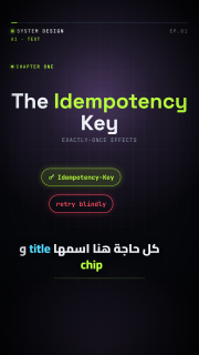
title | 960×240 | rise | base | Big display text; accent markup colors words with the accent color. |
label | 640×60 | fade | base | Small uppercase monospace label. |
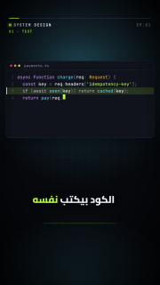
code | 960×520 | rise | base | Code card with token colors that types itself. |
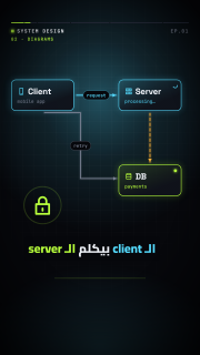
node | 300×170 | pop | base | Box with a title and a sub-status; status changes its color. |
arrow | 200×40 | draw | overlay | Straight, elbow or curved arrow with an optional label and moving packets. |
chip | 340×84 | pop | base | Pill/tag, optionally struck through. |
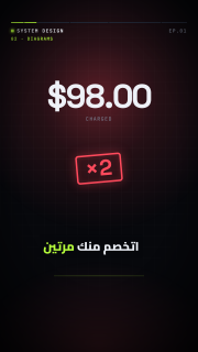
stamp | 680×260 | stamp | overlay | Rotated bordered word that slams in (×2, DEADLOCK). |
table | 960×440 | pop | base | Header + rows with animated row inserts and highlights. |
lanes | 960×760 | pop | base | Parallel columns of timed steps (race conditions). |
checklist | 880×460 | pop | base | Items with check boxes appearing in sequence. |
counter | 820×320 | pop | base | Big number counting between keyframe values. |
meter | 880×180 | pop | base | Horizontal bar (or a half-circle gauge with style: gauge) with an optional threshold marker. |
timeline | 960×260 | pop | base | Axis with markers at relative positions (backoff, TTL). |
grid | 640×640 | pop | base | N×M tiles with per-tile states (thread pool, shards, services). |
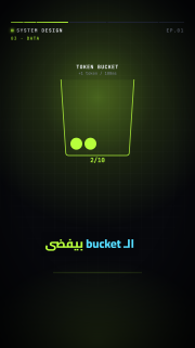
bucket | 440×560 | pop | base | Token bucket whose tokens are consumed and refilled over time. |
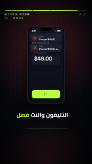
phone | 440×880 | pop | base | Phone mock with a checkout screen, button taps and notifications. |
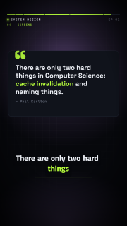
quote | 940×460 | rise | base | Quote card with author; the quote types itself. |
particles | 1080×1000 | none | overlay | Seeded particle bursts, herds, streams, dust or confetti. |
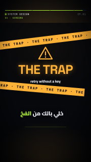
trap | 1080×1000 | glitch | overlay | The series "THE TRAP" interstitial with warning tapes. |
cta | 960×560 | rise | base | "Next episode" title plus a comment box typing a keyword. |
icon | 160×160 | pop | base | Inline SVG icon from the bundled set, or an SVG from assets/. |
bar-chart | 960×560 | fade | base | Vertical or horizontal bars that grow in on enter; keyframable values and a focus bar. |
line-chart | 960×560 | fade | base | One or more series that draw themselves, with points, axis labels and a legend. |
donut-chart | 960×520 | fade | base | Donut whose segments sweep in, with a center value and a legend. |
stat-card | 420×260 | rise | base | KPI card: a value counting up, a label and an up/down delta. |
progress-ring | 360×360 | pop | base | Circular percentage that fills to its value (keyframable). |
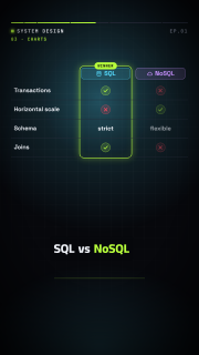
comparison | 960×560 | rise | base | A vs B columns with rows of attributes (check/cross or values) and a winner. |
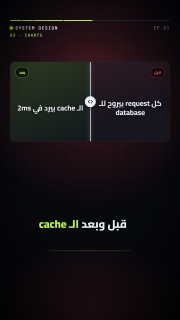
before-after | 960×520 | rise | base | Two panels (text or an assets/ image) revealed by an animated wipe divider. |
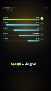
ranking | 960×560 | fade | base | Ordered horizontal bars with rank numbers that grow in sequence. |
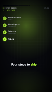
steps | 760×620 | fade | base | Numbered steps appearing one by one, vertical or horizontal. |
flow | 960×300 | fade | base | Horizontal pipeline of stages with connectors and a moving token. |
org-chart | 960×560 | fade | base | Tree of person/role boxes (nested or parent ids) with automatic layout. |
tree | 960×560 | fade | base | Generic hierarchy with automatic layout; branches draw in level by level. |
cycle | 760×760 | fade | base | Stages around a circle with arrows; the active stage is highlighted over time. |
funnel | 760×620 | fade | base | Stages narrowing from top to bottom, with values and optional conversion rates. |
pyramid | 760×620 | fade | base | Stacked levels from a narrow top to a wide base, labelled at the side. |
matrix-2x2 | 760×760 | fade | base | 2×2 quadrants (top-left, top-right, bottom-left, bottom-right) with axis labels and placed items. |
map | 960×600 | fade | base | World or regional outline map (Natural Earth, public domain): highlighted countries, labelled pins and routes that draw between them. |
route | 960×420 | fade | base | A→B path through waypoints with a moving vehicle (truck, ship, plane, ambulance, train, …). |
floor-plan | 860×600 | fade | base | Rooms drawn from rectangles on a grid, with labels and rooms highlighted over time. |
building | 600×760 | fade | base | Stacked floors (listed from the ground up) with labels; floors are highlighted over time. |
container-stack | 860×560 | fade | base | Shipping containers with their codes, stacked bottom-up like a crane loads them. |
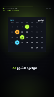
calendar | 760×700 | fade | base | Month view (English or Arabic names) whose highlighted days appear over time. |
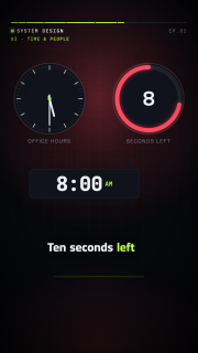
clock | 420×420 | pop | base | Analog or digital clock that ticks between keyframed times, or a countdown (mode: countdown). |
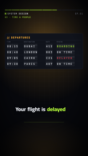
schedule-board | 960×520 | fade | base | Departures/arrivals split-flap board whose rows and later updates flip into place. |
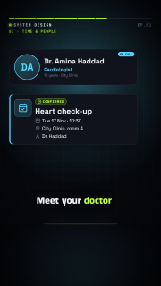
appointment | 760×340 | rise | base | Appointment card: title, date and time, place and a status chip (states can change it). |
person-card | 640×220 | rise | base | Person with an avatar (initials, an icon or an assets/ image), name and role. |
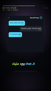
chat | 760×760 | fade | base | Message bubbles (left/right, LTR or RTL) that appear in order, with a typing indicator. |
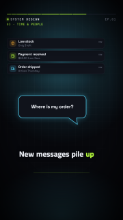
notification | 760×520 | fade | base | Stack of notification toasts sliding in one after another (newest on top). |
speech-bubble | 640×300 | pop | base | Speech or thought bubble with a tail; optionally types itself. |
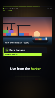
lower-third | 860×170 | wipe | overlay | Name and title bar that wipes in over the scene (overlay layer). |
image | 860×600 | fade | base | Image from assets/ (cover or contain) with a slow Ken Burns pan and zoom over its lifetime. |
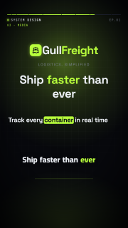
logo | 600×240 | pop | base | Logo slot: an assets/ image, or a text wordmark with an optional icon mark and tagline. |
kinetic-text | 960×400 | fade | base | Headline revealed word by word (pop, slide or highlight), staggered or on word beats. |
bullet-list | 860×520 | fade | base | Bulleted or numbered points appearing one by one. |
callout | 360×110 | draw | overlay | Annotation label with a curved arrow pointing at an element (to: id or id.side) or a point. |
spotlight | 1080×1000 | fade | overlay | Dims the whole scene except one element (target: id) or box, with an optional label. |
split-screen | 960×600 | rise | base | Two halves side by side (or stacked), each with a title, text, icon or assets/ image. |
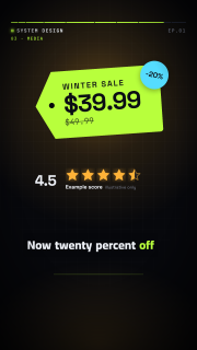
pricing-table | 960×620 | fade | base | Plans with prices and feature lists and a featured plan; variant: tag draws one price tag. |
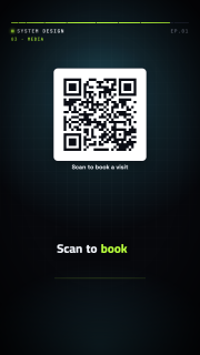
qr-code | 420×500 | fade | base | Scannable QR code (byte mode, ECC L or M, versions 1–10) encoded in the runtime. |
rating | 640×200 | pop | base | Stars from 0 to max with halves, filling in turn. For illustrative scores only, never as real customer reviews. |
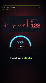
vitals | 860×360 | fade | base | Heart-rate monitor: an ECG trace sweeping across with a live BPM counter (keyframable). |
title
Big display text; accent markup colors words with the accent color.
| Prop | Type | Default | Required |
|---|---|---|---|
text | string | yes | |
size | number | ||
align | left | center | right | "center" | |
color | string | "ink" | |
accent | string | "lime" | |
font | auto | display | arabic | mono | "auto" | |
weight | integer | 800 | |
sub | string |
label
Small uppercase monospace label.
| Prop | Type | Default | Required |
|---|---|---|---|
text | string | yes | |
color | string | "dim" | |
size | number | ||
align | start | left | center | right | "start" | |
dot | boolean | false |
code
Code card with token colors that types itself.
| Prop | Type | Default | Required |
|---|---|---|---|
title | string | ||
lang | string | "ts" | |
lines | (string | object)[] | yes | |
fontSize | number | 30 | |
cps | number | 28 | |
caret | boolean | true | |
numbers | boolean | true | |
typing | boolean | true | |
highlight | object[] | [] |
node
Box with a title and a sub-status; status changes its color.
| Prop | Type | Default | Required |
|---|---|---|---|
title | string | yes | |
sub | string | ||
color | string | "cyan" | |
status | idle | ok | err | warn | busy | off | "idle" | |
icon | icon name (list) | ||
badge | string |
arrow
Straight, elbow or curved arrow with an optional label and moving packets.
| Prop | Type | Default | Required |
|---|---|---|---|
from | string | object | yes | |
to | string | object | yes | |
label | string | ||
color | string | "dim" | |
dashed | boolean | false | |
route | straight | elbow | curve | "straight" | |
width | number | 5 | |
head | end | start | both | none | "end" | |
packet | boolean | object | false | |
packets | object[] | [] | |
gap | number | 14 |
chip
Pill/tag, optionally struck through.
| Prop | Type | Default | Required |
|---|---|---|---|
text | string | yes | |
color | string | "lime" | |
strike | boolean | time | false | |
icon | icon name (list) | ||
variant | solid | outline | soft | "soft" | |
size | number | 34 |
stamp
Rotated bordered word that slams in (×2, DEADLOCK).
| Prop | Type | Default | Required |
|---|---|---|---|
text | string | yes | |
color | string | "red" | |
size | number | 120 | |
rot | number | -5 |
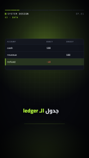
table
Header + rows with animated row inserts and highlights.
| Prop | Type | Default | Required |
|---|---|---|---|
columns | string[] | yes | |
rows | object[] | [] | |
widths | number[] | ||
fontSize | number | 28 | |
accent | string | "lime" |
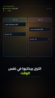
lanes
Parallel columns of timed steps (race conditions).
| Prop | Type | Default | Required |
|---|---|---|---|
lanes | object[] | yes | |
interleave | boolean | true | |
fontSize | number | 26 |
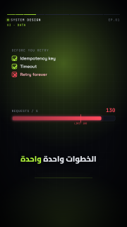
checklist
Items with check boxes appearing in sequence.
| Prop | Type | Default | Required |
|---|---|---|---|
title | string | ||
items | object[] | yes | |
fontSize | number | 36 | |
color | string | "lime" |
counter
Big number counting between keyframe values.
| Prop | Type | Default | Required |
|---|---|---|---|
keyframes | object[] | yes | |
from | number | 0 | |
prefix | string | "" | |
suffix | string | "" | |
decimals | integer | 0 | |
separator | boolean | true | |
label | string | ||
color | string | "ink" | |
size | number | 180 |
meter
Horizontal bar (or a half-circle gauge with style: gauge) with an optional threshold marker.
| Prop | Type | Default | Required |
|---|---|---|---|
keyframes | object[] | yes | |
from | number | 0 | |
max | number | 100 | |
threshold | number | ||
label | string | ||
unit | string | "" | |
color | string | "lime" | |
danger | string | "red" | |
style | bar | gauge | "bar" |
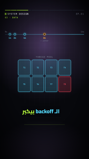
timeline
Axis with markers at relative positions (backoff, TTL).
| Prop | Type | Default | Required |
|---|---|---|---|
markers | object[] | [] | |
start | string | ||
end | string | ||
color | string | "cyan" | |
cursor | object[] | [] |
grid
N×M tiles with per-tile states (thread pool, shards, services).
| Prop | Type | Default | Required |
|---|---|---|---|
cols | integer | yes | |
rows | integer | yes | |
tiles | (string | object)[] | [] | |
steps | object[] | [] | |
gap | number | 14 | |
label | string |
bucket
Token bucket whose tokens are consumed and refilled over time.
| Prop | Type | Default | Required |
|---|---|---|---|
capacity | integer | yes | |
keyframes | object[] | [] | |
label | string | ||
rate | string | ||
color | string | "lime" |
phone
Phone mock with a checkout screen, button taps and notifications.
| Prop | Type | Default | Required |
|---|---|---|---|
title | string | "Checkout" | |
amount | string | ||
item | string | ||
button | string | "Pay now" | |
notifications | object[] | [] | |
taps | object[] | [] | |
offline | boolean | false | |
loading | boolean | false | |
success | boolean | string | false |
quote
Quote card with author; the quote types itself.
| Prop | Type | Default | Required |
|---|---|---|---|
text | string | yes | |
author | string | ||
highlight | string[] | [] | |
cps | number | 32 | |
color | string | "lime" | |
size | number | 56 |
particles
Seeded particle bursts, herds, streams, dust or confetti.
| Prop | Type | Default | Required |
|---|---|---|---|
kind | burst | herd | stream | dust | confetti | "burst" | |
from | string | object | ||
to | string | object | ||
count | integer | 40 | |
at | time | ||
dur | number | 1.2 | |
color | string | "lime" | |
colors | string[] | ||
size | number | 10 | |
spread | number | 140 | |
seed | integer | 1 |
trap
The series "THE TRAP" interstitial with warning tapes.
| Prop | Type | Default | Required |
|---|---|---|---|
title | string | "THE TRAP" | |
sub | string | ||
at | time | ||
until | time | ||
color | string | "amber" |
cta
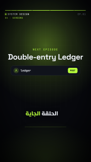
"Next episode" title plus a comment box typing a keyword.
| Prop | Type | Default | Required |
|---|---|---|---|
label | string | "NEXT EPISODE" | |
next | string | yes | |
keyword | string | ||
prompt | string | "Comment" | |
at | time | ||
color | string | "lime" |
icon
Inline SVG icon from the bundled set, or an SVG from assets/.
| Prop | Type | Default | Required |
|---|---|---|---|
name | icon name (list) | ||
src | string | ||
size | number | 140 | |
color | string | "ink" | |
pulse | boolean | false | |
ring | boolean | false |
bar-chart
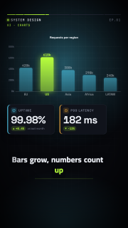
Vertical or horizontal bars that grow in on enter; keyframable values and a focus bar.
| Prop | Type | Default | Required |
|---|---|---|---|
bars | object[] | yes | |
orient | vertical | horizontal | "vertical" | |
min | number | ||
max | number | ||
title | string | ||
values | boolean | true | |
grid | boolean | true | |
focus | integer | object | ||
prefix | string | "" | |
suffix | string | "" | |
decimals | integer | 0 | |
color | string | "cyan" | |
accent | string | "lime" | |
stagger | number | 0.12 | |
dur | number | 0.8 | |
fontSize | number | 26 |
line-chart
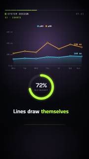
One or more series that draw themselves, with points, axis labels and a legend.
| Prop | Type | Default | Required |
|---|---|---|---|
series | object[] | yes | |
labels | string[] | [] | |
min | number | ||
max | number | ||
title | string | ||
points | boolean | true | |
area | boolean | true | |
grid | boolean | true | |
legend | boolean | true | |
prefix | string | "" | |
suffix | string | "" | |
decimals | integer | 0 | |
color | string | "cyan" | |
stagger | number | 0.3 | |
dur | number | 1.4 | |
fontSize | number | 24 |
donut-chart
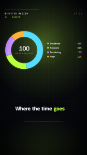
Donut whose segments sweep in, with a center value and a legend.
| Prop | Type | Default | Required |
|---|---|---|---|
segments | object[] | yes | |
total | number | ||
label | string | ||
value | string | ||
show | percent | value | none | "percent" | |
legend | boolean | true | |
thickness | number | 0.3 | |
prefix | string | "" | |
suffix | string | "" | |
decimals | integer | 0 | |
color | string | "cyan" | |
dur | number | 1.2 | |
fontSize | number | 28 |
stat-card
KPI card: a value counting up, a label and an up/down delta.
| Prop | Type | Default | Required |
|---|---|---|---|
label | string | yes | |
value | number | yes | |
from | number | 0 | |
keyframes | object[] | ||
prefix | string | "" | |
suffix | string | "" | |
decimals | integer | 0 | |
separator | boolean | true | |
delta | number | string | ||
deltaSuffix | string | "%" | |
good | up | down | "up" | |
sub | string | ||
icon | icon name (list) | ||
color | string | "ink" | |
accent | string | "cyan" | |
dur | number | 1.2 | |
size | number | 96 |
progress-ring
Circular percentage that fills to its value (keyframable).
| Prop | Type | Default | Required |
|---|---|---|---|
value | number | yes | |
max | number | 100 | |
from | number | 0 | |
keyframes | object[] | ||
label | string | ||
prefix | string | "" | |
suffix | string | "%" | |
decimals | integer | 0 | |
color | string | "lime" | |
thickness | number | 28 | |
dur | number | 1.2 |
comparison
A vs B columns with rows of attributes (check/cross or values) and a winner.
| Prop | Type | Default | Required |
|---|---|---|---|
a | object | yes | |
b | object | yes | |
rows | object[] | yes | |
winner | a | b | object | ||
badge | string | "WINNER" | |
accent | string | "lime" | |
stagger | number | 0.35 | |
fontSize | number | 32 |
before-after
Two panels (text or an assets/ image) revealed by an animated wipe divider.
| Prop | Type | Default | Required |
|---|---|---|---|
before | object | yes | |
after | object | yes | |
at | time | ||
dur | number | 1.1 | |
split | number | 0.5 | |
fontSize | number | 44 |
ranking
Ordered horizontal bars with rank numbers that grow in sequence.
| Prop | Type | Default | Required |
|---|---|---|---|
items | object[] | yes | |
sort | boolean | true | |
order | bottom-up | top-down | "bottom-up" | |
max | number | ||
values | boolean | true | |
prefix | string | "" | |
suffix | string | "" | |
decimals | integer | 0 | |
color | string | "cyan" | |
accent | string | "lime" | |
stagger | number | 0.3 | |
dur | number | 0.7 | |
fontSize | number | 30 |
steps
Numbered steps appearing one by one, vertical or horizontal.
| Prop | Type | Default | Required |
|---|---|---|---|
items | object[] | yes | |
orient | vertical | horizontal | "vertical" | |
color | string | "lime" | |
stagger | number | 0.5 | |
fontSize | number | 40 |
flow
Horizontal pipeline of stages with connectors and a moving token.
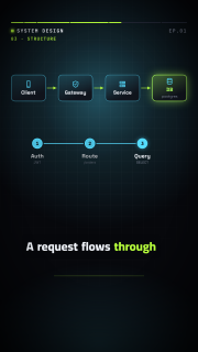
| Prop | Type | Default | Required |
|---|---|---|---|
stages | object[] | yes | |
token | boolean | object | true | |
color | string | "cyan" | |
accent | string | "lime" | |
stagger | number | 0.25 | |
fontSize | number | 28 |
org-chart
Tree of person/role boxes (nested or parent ids) with automatic layout.
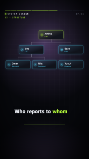
| Prop | Type | Default | Required |
|---|---|---|---|
people | object[] | yes | |
color | string | "cyan" | |
accent | string | "lime" | |
stagger | number | 0.35 | |
fontSize | number | 30 |
tree
Generic hierarchy with automatic layout; branches draw in level by level.
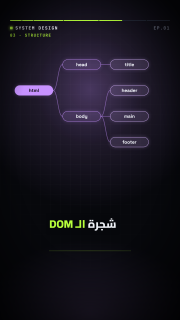
| Prop | Type | Default | Required |
|---|---|---|---|
nodes | object[] | yes | |
orient | down | right | "down" | |
color | string | "violet" | |
stagger | number | 0.3 | |
fontSize | number | 28 |
cycle
Stages around a circle with arrows; the active stage is highlighted over time.
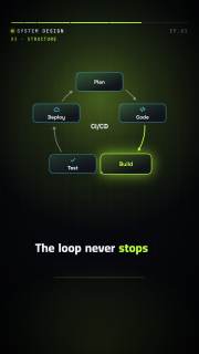
| Prop | Type | Default | Required |
|---|---|---|---|
stages | object[] | yes | |
active | object[] | [] | |
step | number | 0.8 | |
center | string | ||
color | string | "cyan" | |
accent | string | "lime" | |
stagger | number | 0.15 | |
fontSize | number | 28 |
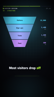
funnel
Stages narrowing from top to bottom, with values and optional conversion rates.
| Prop | Type | Default | Required |
|---|---|---|---|
stages | object[] | yes | |
rate | boolean | false | |
neck | number | 0.32 | |
prefix | string | "" | |
suffix | string | "" | |
decimals | integer | 0 | |
color | string | "cyan" | |
accent | string | "violet" | |
stagger | number | 0.3 | |
fontSize | number | 32 |
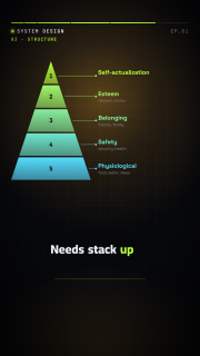
pyramid
Stacked levels from a narrow top to a wide base, labelled at the side.
| Prop | Type | Default | Required |
|---|---|---|---|
levels | object[] | yes | |
order | bottom-up | top-down | "bottom-up" | |
color | string | "cyan" | |
accent | string | "lime" | |
stagger | number | 0.3 | |
fontSize | number | 32 |
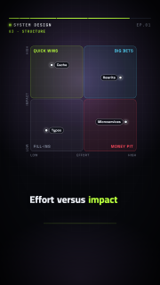
matrix-2x2
2×2 quadrants (top-left, top-right, bottom-left, bottom-right) with axis labels and placed items.
| Prop | Type | Default | Required |
|---|---|---|---|
x | object | {} | |
y | object | {} | |
quadrants | object[] | [] | |
items | object[] | [] | |
color | string | "cyan" | |
stagger | number | 0.3 | |
fontSize | number | 26 |
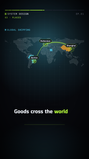
map
World or regional outline map (Natural Earth, public domain): highlighted countries, labelled pins and routes that draw between them.
| Prop | Type | Default | Required |
|---|---|---|---|
view | world | africa | europe | asia | middle-east | north-america | south-america | oceania | object | "world" | |
countries | (string | object)[] | [] | |
pins | object[] | [] | |
routes | object[] | [] | |
graticule | boolean | true | |
color | string | "cyan" | |
accent | string | "lime" | |
stagger | number | 0.3 | |
fontSize | number | 26 |
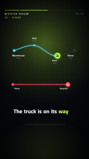
route
A→B path through waypoints with a moving vehicle (truck, ship, plane, ambulance, train, …).
| Prop | Type | Default | Required |
|---|---|---|---|
stops | object[] | yes | |
vehicle | truck | ship | plane | ambulance | train | car | bus | bike | "truck" | |
progress | object[] | ||
dur | number | 2.4 | |
curve | boolean | true | |
color | string | "cyan" | |
accent | string | "lime" | |
fontSize | number | 28 |
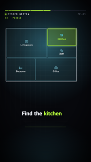
floor-plan
Rooms drawn from rectangles on a grid, with labels and rooms highlighted over time.
| Prop | Type | Default | Required |
|---|---|---|---|
cols | integer | 12 | |
rows | integer | 8 | |
rooms | object[] | yes | |
highlights | object[] | [] | |
color | string | "cyan" | |
accent | string | "lime" | |
stagger | number | 0.08 | |
fontSize | number | 26 |
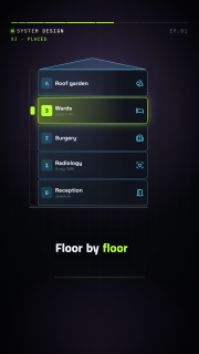
building
Stacked floors (listed from the ground up) with labels; floors are highlighted over time.
| Prop | Type | Default | Required |
|---|---|---|---|
floors | object[] | yes | |
highlights | object[] | [] | |
numbers | boolean | true | |
ground | string | "G" | |
color | string | "cyan" | |
accent | string | "lime" | |
stagger | number | 0.12 | |
fontSize | number | 30 |
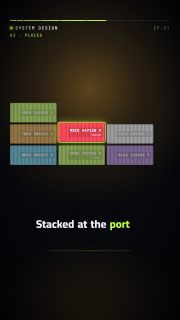
container-stack
Shipping containers with their codes, stacked bottom-up like a crane loads them.
| Prop | Type | Default | Required |
|---|---|---|---|
containers | object[] | yes | |
cols | integer | 4 | |
focus | integer | object | ||
color | string | "cyan" | |
accent | string | "lime" | |
stagger | number | 0.12 | |
fontSize | number | 22 |
calendar
Month view (English or Arabic names) whose highlighted days appear over time.
| Prop | Type | Default | Required |
|---|---|---|---|
year | integer | yes | |
month | integer | yes | |
lang | en | ar | "en" | |
weekStart | mon | sun | sat | "mon" | |
weekdays | string[] | ||
monthName | string | ||
digits | latn | arab | "latn" | |
days | (integer | object)[] | [] | |
color | string | "cyan" | |
accent | string | "lime" | |
stagger | number | 0.2 | |
fontSize | number | 30 |
clock
Analog or digital clock that ticks between keyframed times, or a countdown (mode: countdown).
| Prop | Type | Default | Required |
|---|---|---|---|
mode | clock | countdown | "clock" | |
face | analog | digital | "analog" | |
time | string | "09:00" | |
keyframes | object[] | ||
hours | 24 | 12 | "24" | |
seconds | boolean | false | |
from | number | 10 | |
at | time | ||
label | string | ||
color | string | "ink" | |
accent | string | "lime" |
schedule-board
Departures/arrivals split-flap board whose rows and later updates flip into place.
| Prop | Type | Default | Required |
|---|---|---|---|
title | string | "DEPARTURES" | |
icon | icon name (list) | "plane-takeoff" | |
columns | string[] | ["TIME","DESTINATION","GATE","STATUS"] | |
widths | number[] | ||
rows | object[] | yes | |
updates | object[] | [] | |
flip | number | 0.7 | |
color | string | "amber" | |
stagger | number | 0.25 | |
fontSize | number | 30 |
appointment
Appointment card: title, date and time, place and a status chip (states can change it).
| Prop | Type | Default | Required |
|---|---|---|---|
title | string | yes | |
date | string | yes | |
time | string | ||
place | string | ||
person | string | ||
status | confirmed | pending | cancelled | done | "confirmed" | |
statusText | string | ||
icon | icon name (list) | "calendar-check" | |
color | string | "cyan" |
person-card
Person with an avatar (initials, an icon or an assets/ image), name and role.
| Prop | Type | Default | Required |
|---|---|---|---|
name | string | yes | |
role | string | ||
sub | string | ||
src | string | ||
initials | string | ||
icon | icon name (list) | ||
badge | string | ||
layout | horizontal | vertical | "horizontal" | |
color | string | "cyan" |
chat
Message bubbles (left/right, LTR or RTL) that appear in order, with a typing indicator.
| Prop | Type | Default | Required |
|---|---|---|---|
title | string | ||
messages | object[] | yes | |
typing | number | 0.7 | |
dir | auto | ltr | rtl | "auto" | |
color | string | "cyan" | |
stagger | number | 1.1 | |
fontSize | number | 36 |
notification
Stack of notification toasts sliding in one after another (newest on top).
| Prop | Type | Default | Required |
|---|---|---|---|
items | object[] | yes | |
color | string | "cyan" | |
stagger | number | 0.6 | |
fontSize | number | 28 |
speech-bubble
Speech or thought bubble with a tail; optionally types itself.
| Prop | Type | Default | Required |
|---|---|---|---|
text | string | yes | |
tail | bottom-left | bottom-right | top-left | top-right | none | "bottom-left" | |
style | speech | thought | "speech" | |
cps | number | 0 | |
color | string | "cyan" | |
fontSize | number | 40 |
lower-third
Name and title bar that wipes in over the scene (overlay layer).
| Prop | Type | Default | Required |
|---|---|---|---|
name | string | yes | |
title | string | ||
icon | icon name (list) | ||
color | string | "lime" | |
fontSize | number | 52 |
image
Image from assets/ (cover or contain) with a slow Ken Burns pan and zoom over its lifetime.
| Prop | Type | Default | Required |
|---|---|---|---|
src | string | yes | |
fit | cover | contain | "cover" | |
kenburns | boolean | true | |
zoom | number | 1.12 | |
pan | center | left | right | up | down | "right" | |
caption | string | ||
radius | number | 26 | |
color | string | "ink" |
logo
Logo slot: an assets/ image, or a text wordmark with an optional icon mark and tagline.
| Prop | Type | Default | Required |
|---|---|---|---|
src | string | ||
text | string | ||
tagline | string | ||
icon | icon name (list) | ||
color | string | "ink" | |
accent | string | "lime" | |
size | number | 96 |
kinetic-text
Headline revealed word by word (pop, slide or highlight), staggered or on word beats.
| Prop | Type | Default | Required |
|---|---|---|---|
text | string | yes | |
style | pop | slide | highlight | "pop" | |
beats | object[] | [] | |
size | number | ||
align | left | center | right | "center" | |
color | string | "ink" | |
accent | string | "lime" | |
stagger | number | 0.18 | |
weight | integer | 800 |
bullet-list
Bulleted or numbered points appearing one by one.
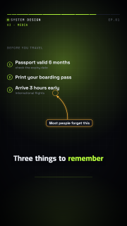
| Prop | Type | Default | Required |
|---|---|---|---|
title | string | ||
items | (string | object)[] | yes | |
marker | dot | number | check | dash | icon | "dot" | |
color | string | "lime" | |
stagger | number | 0.45 | |
fontSize | number | 40 |
callout
Annotation label with a curved arrow pointing at an element (to: id or id.side) or a point.
| Prop | Type | Default | Required |
|---|---|---|---|
to | string | object | yes | |
text | string | yes | |
color | string | "amber" | |
curve | boolean | true | |
ring | boolean | true | |
fontSize | number | 30 |
spotlight
Dims the whole scene except one element (target: id) or box, with an optional label.
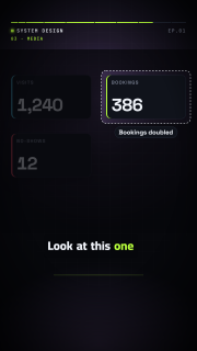
| Prop | Type | Default | Required |
|---|---|---|---|
target | string | object | yes | |
shape | rect | circle | "rect" | |
padding | number | 24 | |
dim | number | 0.72 | |
label | string | ||
at | time | ||
until | time | ||
color | string | "ink" |
split-screen
Two halves side by side (or stacked), each with a title, text, icon or assets/ image.
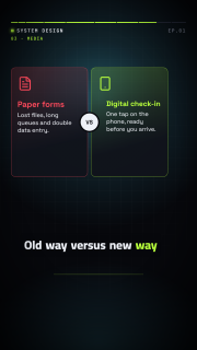
| Prop | Type | Default | Required |
|---|---|---|---|
a | object | yes | |
b | object | yes | |
split | columns | rows | "columns" | |
badge | string | ||
stagger | number | 0.35 | |
fontSize | number | 40 |
pricing-table
Plans with prices and feature lists and a featured plan; variant: tag draws one price tag.
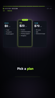
| Prop | Type | Default | Required |
|---|---|---|---|
variant | table | tag | "table" | |
plans | object[] | yes | |
currency | string | "$" | |
color | string | "cyan" | |
accent | string | "lime" | |
stagger | number | 0.25 | |
fontSize | number | 30 |
qr-code
Scannable QR code (byte mode, ECC L or M, versions 1–10) encoded in the runtime.
| Prop | Type | Default | Required |
|---|---|---|---|
text | string | yes | |
ecc | L | M | "M" | |
label | string | ||
draw | boolean | true | |
color | string | "#0b0d14" | |
background | string | "#ffffff" |
rating
Stars from 0 to max with halves, filling in turn. For illustrative scores only, never as real customer reviews.
| Prop | Type | Default | Required |
|---|---|---|---|
value | number | yes | |
max | integer | 5 | |
label | string | ||
note | string | ||
numbers | boolean | true | |
color | string | "amber" | |
dur | number | 1 | |
size | number | 76 |
vitals
Heart-rate monitor: an ECG trace sweeping across with a live BPM counter (keyframable).
| Prop | Type | Default | Required |
|---|---|---|---|
bpm | number | 72 | |
keyframes | object[] | ||
label | string | "HEART RATE" | |
unit | string | "BPM" | |
threshold | number | ||
window | number | 3 | |
grid | boolean | true | |
color | string | "lime" | |
danger | string | "red" |
Icons
258 bundled icons, usable wherever a prop takes an icon name: the ReelForge set and a subset of Lucide (ISC).
lock, unlock, bell, clock, warn, bubble, bomb, check, x, server, db, user, users, bolt, card, wifi, wifi-off, cloud, key, mail, cart, cpu, queue, shield, fire, refresh, hourglass, phone, code, globe, heart-pulse, stethoscope, pill, syringe, hospital, ambulance, activity, thermometer, bandage, cross, microscope, dna, brain, bone, baby, accessibility, test-tube, clipboard-plus, heart, hand-heart, eye, ear, tablets, pill-bottle, bed, briefcase-medical, shield-plus, scan-heart, house, building, building-complex, hotel, key-round, door-open, door-closed, sofa, bath, ruler, landmark, fence, trees, tree-pine, house-plus, map-pin-house, bed-double, ship, anchor, container, package, package-check, package-open, boxes, forklift, truck, warehouse, barcode, scan-barcode, route, waypoints, map, map-pin, map-pinned, navigation, compass, earth, weight, scale, clipboard-list, clipboard-check, plane, plane-takeoff, plane-landing, train-front, bus, car, bike, sailboat, fuel, ticket, luggage, cable-car, traffic-cone, milestone, signpost, rocket, graduation-cap, book, book-open, school, pencil, pen-tool, notebook, library, backpack, calculator, presentation, lightbulb, award, trophy, medal, atom, flask-conical, wallet, banknote, coins, piggy-bank, credit-card, receipt, chart-line, chart-column, chart-pie, trending-up, trending-down, dollar-sign, percent, hand-coins, badge-dollar-sign, briefcase, vault, circle-dollar-sign, utensils, utensils-crossed, chef-hat, coffee, pizza, apple, carrot, croissant, cake, wine, beer, cup-soda, ice-cream-cone, soup, sandwich, salad, cooking-pot, fish, wheat, shopping-bag, shopping-basket, store, tag, tags, gift, shirt, badge-percent, gavel, flag, vote, id-card, file-text, stamp, shield-check, scroll, badge-check, siren, fingerprint-pattern, zap, battery, battery-charging, sun, wind, droplet, droplets, flame, plug, plug-zap, power, gauge, leaf, recycle, solar-panel, waves-horizontal, cloud-sun, moon, snowflake, factory, cog, settings, wrench, hammer, drill, hard-hat, construction, pickaxe, bot, cable, shovel, paint-bucket, camera, tree-palm, mountain, mountain-snow, tent, umbrella, binoculars, castle, search, star, thumbs-up, message-circle, send, calendar, calendar-check, calendar-days, alarm-clock, timer, info, circle-question-mark, circle-check, circle-x, triangle-alert, plus, arrow-right, link, image, mic, qr-code, smartphone, sparkles, target, crown, user-plus, user-check, phone-call, megaphone, newspaper